Wednesday, June 6, 2012

AGIDEAS

Trends and Designers
A common trend noticed through out the 2012 Melbourne AGIdeas Convention was collaboration. Collaboration with other designers, other fields of expertise such as photographer, modelling, illustrating and installation/mechanics.
Speakers such as Paul Marcus who advocates play, share and explore. Through out his presentation he spoke of trust and respect when working with others. Learn from collaboration, explore. Skills and knowledge can be gained in new places created new ways of working.
Linda Jukic is a project director. She deals with different individuals working together and collaborates with them to create something spectacular that on their owns could't possibly achieve.
Some collaborations do not always turn out to plan and for some wild ideas the possibility of that idea  may be extinguished. However through effort, experimenting and simple trying, many grand designs can be done on a large variety of scales and mediums.


Concept Evaluation
Ree Treweek is an quirky illustrator from South Africa and a member of 'The Blackheart Gang'. She creates illustrations of dark, twisted little characters that appear regular but have an abnormality to them.
One of her popular works is the 'Tale of How' short animation and now book, she along with other members produce illustrations to go along with a fairy tale story.
This illustration is a shot from the short film of 'The Tale of How' and portrays dodo birds that live in a tree on top of an octopus reffered to the terror of the indian ocean, Otto the Monster. This illustration has gone through many processes from hand sketches to computer rendering and to animation.
The illustration portrays the piranha dodo birds out in the ocean with tentacles immersing from the ocean waves. The piranha  dodo birds also have weird attachments to themselves such as a foot or a crane on top of their head. This relates to the bizarre illustration style Treweek is known for. The overall feel of the illustration is dark & dull colours, the mood is quite dismal as the dodo birds are generally eaten by the octopus until their escape. Besides the characters there are fine details everywhere. In the waves and clouds are numerous of lines and the greenery is illustrated in fine floral and leaf designs. everything has a texture to it, a very detailed texture that brings the illustration to life. This illustration is the start of the short film created using these illustrations, which the effect of the short film is very illustrative and almost pop up book/paper puppetry.
Here is a link to the short film behind the illustration: The Tale of How

Bibliography:
Notes taken during the AGIdeas Convention

Tuesday, April 17, 2012

Copy Right Issues

Copy right Issues for Fonts
Fonts can be found and used from a variety of internet sites. Some are free other require you to pay for a licence. In a job a licence is always required by law. You pay for the use of that font lending you the copyright for that font for that one job. Repeated use requires repeat payments.

Identifont- Indentifont is a font website that allows you to search through fonts by appearance, name, similarity, picture, designer and publisher. This site supplies free fonts but also fonts that you can buy but it refers to another site to do so.


Font ShopHas over 150,000 fonts in every style and category. You can search the fonts through type, style or structure of the font you desire. 


Font FontFontShop International and its FontFont label was founded by Neville Brody and Erik Spiekermann in 1990 in Berlin and is now one of the largest manufacturers of digital typefaces in the world. The world’s largest library of original contemporary typefaces. There are about 743 font families.


Terms & Conditions - 
Identifont website has a link dedicated to Terms of use which is the same for most font sites. There is conditions on personal use, privacy policy, copyright, links and disclaimers. Their copyright statement for the fonts and typefaces on the website states  that the components of the Web site, including the text and graphics, are copyright materials and may not be copied or used for any other purpose without the prior written permission of the copyright holder. Typeface names featured on this Web site are registered trademarks or trademarks of their respective holders.


Copy Right Issues for Images
Images off the internet are copyrighted unless purchased. Using images in work found on the internet and websites such as Google are illegal because you don't not have permission from the owner to use his/her work. You can how ever purchase images from off certain websites. 'stock images'.


iStock - iStockphoto is a website source for royalty-free stock images, media and design elements. All iStock files are royalty-free which means you only have to pay once to use the file multiple times as long as its used within the terms of the license agreement will not infringe on any copyright, moral right, trademark or other intellectual property right, or violate any right of privacy or publicity.


Shutter Stock Shutterstock is one of the largest subscription-based stock photo agency. Consists of 18,999,510 royalty-free stock photos, illustrations, and vectors.


Sourced Stock Images


Image 1
Lighting Bolt- Could be used within the logo or to support the logo in the background or behind the text or shield.


http://www.shutterstock.com/


Image 2
Shield - Used in the logo with 'T' on top.Help create depth or a 3D effect.


http://www.shutterstock.com/


Image 3
Football & Hands- Used in advertisement for the team or recruitment. Logo in between the arms up the top or one of the bottom corners.


http://www.istockphoto.com/

Tuesday, March 13, 2012

Culture In Design

Indigo Talking Stick- Happiness for Daily Life by Sali Sasaki

http://www.indigodesignnetwork.org/?p=4653&cpage=1#comment-424

Its inspiring to see designers and artist out in the world that still inspire so many. Creating the dull into a vibrant and interesting environment that can be enjoyed by all. The colour scheme really helps send the message of happiness and would love to see more of these cafes around in other cities/countries. 
It is also interesting to see so many different professions working together with the community :)

Aboriginal Motifs

Functions and Philosophies


Principles and Protocols:


1. Respect: "The rights of Indigenous people to own and control their heritage, including Indigenous images, designs, stories and other cultural expressions, should be respected."
http://www.australiacouncil.gov.au/__data/assets/pdf_file/0004/32368/Visual_arts_protocol_guide.pdf

When organising an event, exhibition or festival of local, state or national significant it is respectful to invite representatives of the traditional owners of that land to attend and give a welcome address. It is also respectful of other official speakers/attendees to acknowledge the land and its traditional owners. This would refer to any use of motifs, symbols and methods from or relating to the Indigenous Australians culture. References to their dream time, elders or their land (i.e Uluru) needs to be treated with utmost respect.


2. Recognition and protection
The Indigenous Australians visual artists own copyright in his or her artwork. This means that he or she can control the reproduction and termination of the artwork. Such rights apply to all artists and are granted under the national copyright law. This protects any interpretation or alterations to traditional or recent indigenous artwork. Respect also goes hand in hand with understanding boundaries and rights.

Moral Rights and Issues


The Moral Rights Amendments to the Copyright Act was introduced in December 2000. It provided some new ways to challenge any inappropriate treatment of Indigenous artworks. 
The new law provides the following rights to artists; The right to be attributed as the artist (Artist can require their names to be clearly and prominently produced alongside with all and any reproductions of the artists work), the right not to have work falsely attributed to another artist (Artist can take action against parties who falsely attribute others as the artists of their work), the right of integrity (Artist can take action against parties who subject their works to inappropriate treatment i.e anything the results to material distortion, destruction of the work, public harm to the artist reputation, reproducing in poor quality. The artist always has moral rights to his or hers artwork.


Bibliography:
http://www.australiacouncil.gov.au/__data/assets/pdf_file/0004/32368/Visual_arts_protocol_guide.pdf

Native American Motifs


SPOKANE INDIANS

Minor League Baseball
Spokane, Washington, United States.

FORMER LOGO – CURRENT LOGO – SECONDARY LOGO


The Spokane Indians former logo was re-designed in 2006. They're intention was to avoid using traditional native american/indian imagery. The new and current logo is supported by the Spokane Nation and respectfully portray certain Native American elements that have been given permission by the Spokane Nation to use. They honour this privilege with making a secondary logo in the Spokane traditional language, Salish.

The current logo design follows the shape of a baseball- circle. Its circular shape makes the logo unified and stable/fixed in position. Your eye is drawn directly to the centre of the logo with large 'S' then follow the edges around to read the words. The direction is helped by the position and orientation of the feathers.
The feathers are in relation to the native americans culture. Feathers relate to nature and they would use them in ceremonies, rituals and to differentiate from other tribes and ranks/leadership. To the Spokane Nation the eagle feather is a most revered symbol. 
The circle too can be related to Native Americans the sun, moon and earth. Circle is a very universal symbol and relates to alt of spiritual connections.
The logo colours are red, navy blue, light blue and beige. These are all colours of or based off the primary colours. And the beige and the blue contrast slightly but not too garish which gives the red the chance to be the dominant colour in the logo.
The team is believed to be the first professional sports team to work in conjunction with a local Native American Nation/Tribe to create a sports identity.


I believe the current logo has down a successful job in keeping a respectful and cultured logo but also aesthetically pleasing. Its unified and strong. Can be used on various applications (uniforms, labels etc). It also still portrays its main reason which is a baseball team and that is evident with the use of the baseball within the logo.

Bibliography:

Tuesday, March 6, 2012

Greek Sport Logo Thumbnails (Titans)


Movie: Clash of the Titans Questions


Who are the titans? 

There were a lot of Titans. There were 12 original Titans, out of the twelve their daughters and sons some became the second generation of Titans but were better know as the Gods of Olympus. In the movie, 'Clash of the Titans (2010)', the Titans reference applies to the Gods of Olympus. There 12 main Gods, Zeus – leader of the gods, Hera – wife of Zeus and Goddess of all Goddesses, Poseidon – God of the Sea, Dionysus – God of Wine, Apollo – God of Light, Artemis – Virgin Goddess, Hermes – messenger of the Gods, Athena – Goddess of Wisdom, Aphrodite – Goddess of Love, Demeter – Goddess of Fertility and Hephaestus – Blacksmith of the Gods.

How are there any interesting motifs you see frequently? (eg. lightning bolt)
How do they interpret their meaning? Can you do a modern version?

There a numerous motifs appear through out the movie. One is the symbols relating back to ancient greek - the pillars, greek keys and the fashion. There is a lot of focus on the colours and classes. The Gods are shiny white and silver- representing holiness and purity. The upper class of man (humans/mortals) is over the top gold – representing wealth, superiority and luxury. The lower class of man is dull greys, neutrals and off whites – representing average, dull and sadness. However the use of white in the lower class can be read as a connection to the gods – therefore the lower class worships and respect the gods more than the upper class does (which in the movie is perceived true). This is still relevant in modern times as high upper class/superiority is white with appearance, style, luxury and with their belonging i.e apple products are generally white. Also gold still represents wealth and class especially in jewellery. And as for greys and neutrals, our basic/standards items and products appear in the grey/off white colour schemes.

Another motif used frequently in the movie is Zeus's eagle. Zeus constantly transforms into an eagle and it is true that Zeus is connected to an eagle. This can be related to modern day with eagle being noble and proud. Especially relevant to the American culture being the national animal and emblem. 

The Greek helmet is apart of the Greek amour attire, it appears a lot with the soldiers representing the kings army and used to show rank. The Greek helmet is replicated in modern times for sport, war, duty and combat.
Also apart of the armour attire is a three headed dragon symbol on the soldiers shield. This can be interpreted to the symbol/representation of Hydra – a serpent like dragon with multiple heads and the difficulty of with each head cut off, two would take its place. It was slain by Hercules. Dragons have been used on armour, ships and weapons as an ultimate creature that was near difficult to defeat and would strike fear in its opponents. Representing strength and immortality.

The are many motifs relating to specific gods; Zeus and his lighting bolt which appears from the heaven to strike down and either cause destruction or give power to objects/beholders. The mechanical owl appears near the start which in legend is a replica of Athena's owl which guides Perseus to the three witches, which in todays times owls are still perceived as wise creatures. The three witches themselves used as fortune tellers also appears in Shakespeare's production Macbeth.

Is your character in the movie? 
YES! Well technically. The original Titans are mentioned in the place where they were defeated by the Gods of Olympus- the second generation of the Titans and God's themselves are technically Titans.

Is the film interpretation accurate?
Yes how ever there are different legends on the Clash of the Titans and the Titans themselves.

Is there a constellation of starts named after your greek character?
The is a Titan responsible for the starts and the sky – Astraeus a Titan of the stars and planets and the art of astrology. There are few constellations relating to the titans; Aquila is a constellation of an eagle – related to Zeus's eagle. Capricorn is a constellation of a goat – who represents a god that had goatish features that assisted Zeus in the war against the Titans. Centaurus (Sagittarius) a constellation of a centaur with bow and arrow – the wisest of the Centaurs and son of the Titan Cronus.

How is medusa killed?
In the 'Clash of the Titans (2010)', Perseus cuts her head off in order to defeat the Craken with her stone death stare.

Bibliography
Watching the movie 'Clash of the Titans (2010)'

Thursday, March 1, 2012

Style Time Line

Colour Field


Description: Colour field is a style of abstract painting that started in New York CityInspired by the European modernism and is related also to the Abstract Expressionism. Colour field is characterised primarily by large portions of flat, solid colour spread across large areas, creating an unbroken surface and a flat picture plane. There usually aren't any outlines or bold strokes. Create an even and universal look of all colours.
Dates: During the 1940s and 1950s.
Artist(s): Edward Avedisian, an American abstract painter from the 1960's. Josef Albers, a German born American artist and educator.


http://upload.wikimedia.org/wikipedia/en/f/f7/'Beginning',_magna_on_canvas_painting_by_Kenneth_Noland,_Hirshhorn_Museum_and_Sculpture_Garden,_1958..jpg


Underground Comix

Description: Underground comix are small press or self-published comic books. They are often socially relevant or satirical in nature. They differ from mainstream comics, mainly portraying content forbidden to mainstream publications by the Comics Code Authority i.e explicit drug use, sexuality and violence. 

Dates: They were very popular in the United States between 1968 and 1975 and in the United Kingdom between 1973 and 1974.

Artsit(s): Robert Crumb and Gilbert Shelton are cartoonist and were two of the creators.
http://upload.wikimedia.org/wikipedia/en/thumb/c/c4/Zap_Comix1.jpg/250px-Zap_Comix1.jpg


Conceptual Art


Description: Conceptual art is an art form in which the concept/idea involved in the work aren't of traditional aesthetic and material concerns. Most conceptual art works are usually called installations. Some have argued that conceptual art continued this "dematerialization" of art by removing the need for objects altogether, while others, including many of the artists themselves, saw conceptual art as a radical break with Greenberg's kind of formalist Modernism


Dates: Conceptual art emerged during the 1960s.


Artist(s): Marcel Duchamp, a french artist who famously created  the 'Fountain' in 1917 and Joseph Kosuth, an US artist who created 'One and Three Chairs' in 1965.
http://www.sin-stuff.com/affordable/files/gimgs/1_joseph-kosuth-chair.jpg


Dada


Description: Dada (or Dadaism) is a cultural art movement that began in Switzerland. The movement mainly consisted of visual artspoetryart manifestoestheatre, and graphic design. A lot of the topics focused on anti-war and politics. Dada's sole purpose was to ridicule the meaninglessness of the modern world and its pop culture. Dada activities included public gatherings, demonstrations, and publication of art/literary journals, politics, and culture.


Dates: Appeared during World War I and peaked from 1916 to 1922.


Artist(s): Hannah Hoch is a German artist who created post war dada artwork. 
http://libcom.org/files/images/library/dada.jpg


International Typographic Style


Description: The International Typographic Style (also known as the Swiss Style) is a graphic design style developed in Switzerland in the 1950s. It emphasises cleanliness, readability and objectivity. The design layout is generally asymmetric layouts, use of a grid, sans-seriftypefaces with flush left, ragged right text. International Typographic Style mainly features typography as a primary design element.


Dates: Started in the 1950's but would only become the proper graphic style in the 1970's.


Artists: Armin Hofmann and Emil Ruder were some designers that created type based layouts and slightly redefined the style as well.
http://www.aisleone.net/wp-content/uploads/2008/01/its.jpg


Fauvism


Description: Fauvism is the style of 'les Fauves'. It was a short-lived and loose group of early twentieth-century where modern artists works were consistent of strong colours. The style slightly relates back to the Impressionism period.


Dates: Style started between 1900-1910


Artist(s): Henri Matisse and André Derain are famous artist with many successful artworks between them both. 
http://upload.wikimedia.org/wikipedia/en/thumb/f/fb/Matisse-Woman-with-a-Hat.jpg/220px-Matisse-Woman-with-a-Hat.jpg


Naive Art


Description: Naive art is a art style that is characterized by a childlike simplicity. Quite colourful and vibrant generally depicting of people or animals. 


Dates: Goes through from the 18th Century to the 20th Century.


Artist(s): Many artists throughout centuries were apart of the naive art movement one of the earlier ones were Edward Hicks 1780 -1849 and one of the more recent artists Guido Vedovato 1961- recent. http://upload.wikimedia.org/wikipedia/commons/thumb/f/fd/Juego_de_domino.JPG/220px-Juego_de_domino.JPG

LowBrow

Description: Lowbrow art is an underground visual art movement. It emerged in Los Angleos, California but its popularity quickly spread world wide. Its main mediums were underground comix, punk music, hot rod street culture, paintings, toys, digital art and sculptures. Lowbrow art often has a sense of humour with a bit of sarcasm to it.

Dates: Lowbrow came around in the late 1970's

Artist(s): A lot of artists were cartoonists such as Robert Williams and Gary Panter both Americans
http://blogs.sfweekly.com/shookdown/253_HappyWorld_original.jpg


En Plein Air

Description: En Plein Air means in French 'in the open air'. It usually references paintings of open outdoor scenarios. The use of natural light is quite important in the En Plein Air movement. A lot of the paints used during this time artist had to grind their own dry pigment powder which gives the paintings a textural and interesting/unique look. A lot of Impressionist painters moved into the En Plein Air movement as a natural progression in art form.

Dates: Mainly in the mid 19th Century- was very poplar in 1870's. Popularity continued through to the 20th and 21st century.


Artist(s): Impressionist artists  Claude MonetCamille Pissarro, and Pierre-Auguste Renoir were advocates on the En Plien Air style and majority of theirs paintings were outdoors. More modern day painters consist of John Constable, Henri Biva and Ralph Wallace Burton.
http://www.nikkibaschdavis.com/photos/land/MontereyWharf400h.jpg

Pop Art

Description: Pop art is an art movement presented a challenge to traditions of fine art by including imagery from popular culture such as advertising, celebrities, news, brands, newspapers etc. Pop art used aspects of mass culture, such as advertising, comic books and mundane cultural objects aimed to emphasise the banal or kitschy elements of any given modern culture. Artist's would incorporate the use of mechanical means of reproduction or rendering techniques. Pop Art would often portray society in a ironic point of view.


Dates: Popped up in the mid 1950s in Britain and in the late 1950s in the United States.


Artist(s): Most poplar, well known, famous pop artist would be Andy Warhol. Famous for his Campbell's Soup Cans and his Marilyn Monroe.
http://upload.wikimedia.org/wikipedia/en/f/ff/Hamilton-appealing2.jpg


Rococo


Description: Rococo was a new 18th century artistic movement. It covered painting, sculpture, architecture, interior design, fashion, decoration, literature, music and theatre. Rococo went against the earlier movement of Baroque, with its strict symmetry and straight edges, it was more fluid, floral and soft. Ornamentals were greatly exaggerated and enlarged. Colour scheme was usually of soft creamy pastels colours with gold and silver. The design was asymmetrical and curvy with lots of details. Painters would often depict romance and love as they're paintings concept swell as other emotions.


Dates: Predominately was the the 18th Century art movement.


Artist(s): Artist's such as Antoine Watteau, Jean François de Troy and François Boucher lead the way of the Rococo period.


Surrealism


Description: Surrealism was a cultural movement best known for its visual artworks and writings. Surrealist artworks were out there/out of the box/unexpected juxtapose. Some artworks were connected to philosophies and revolution. Said to have developed out of Dada. Quickly spreading around the world during and after World War I changing visual arts, literature, film, music, philosophy and political views. 


Dates: Early 1920's 


Artist(s): Salvador Dalí was a most popular and peculiar artist, depicting a lot of his paintings on dreams and theories or philosophies he became quite popular for his unique point of view of society and his lavishly large moustache.
http://upload.wikimedia.org/wikipedia/en/d/dd/The_Persistence_of_Memory.jpg


Toyism


Description: Toyism was a post modernism art movement of 'anything goes'. Toyism originated from the Netherlands in the 1990's were the concentration was on the craft of painting. The toyist style of painting emphasizes narrative depictions featuring figurative rather than abstract objects, almost cartoon like. It uses heavy use of outlining, bold colors and craftsmanship. Toyist artists usually have a consistent icon or motif in all their paintings.


Dates: The 1970s-1990s to recent, toyism is used 


Artist(s): Artisit of Toyism all conjugate in a group and go by aliases.
http://0.tqn.com/d/arthistory/1/G/e/R/t14_miss_sassy_soulmates.jpg


Bibliography:


http://en.wikipedia.org/wiki/Underground_comix
http://sirrealcomix.mrainey.com/
http://en.wikipedia.org/wiki/Conceptual_art
http://en.wikipedia.org/wiki/Dada
http://arthistory.about.com/cs/arthistory10one/a/dada.htm

http://en.wikipedia.org/wiki/International_Typographic_Style
http://www.internationalposter.com/style-primer/international-typographic.aspx
http://en.wikipedia.org/wiki/Fauvism
http://www.ibiblio.org/wm/paint/tl/20th/fauvism.html
http://en.wikipedia.org/wiki/Naïve_art
http://en.wikipedia.org/wiki/Lowbrow_(art_movement)
http://en.wikipedia.org/wiki/En_plein_air
http://en.wikipedia.org/wiki/Pop_art
http://en.wikipedia.org/wiki/Rococo#Rococo_painting
http://en.wikipedia.org/wiki/Surrealism
http://www.surrealist.com/
http://www.toyism.com/home/
http://arthistory.about.com/od/arthistory101/a/toyism.htm
http://en.wikipedia.org/wiki/Toyism

Wednesday, February 29, 2012

Melbourne Sports Museum


The Australian Coat of Arms


Made 1908 but a new design was granted by Royal Warrant by King George V in 1912. the coat of arms was to be used on 'upon Seals, Shields, Banners, or otherwise according to the Laws of Arms'.

The Australian Coat of Arms are the property of the Commonwealth of Australia. It used by the Commonwealth of Australia to authenticate official documents, to indicate ownership of property, and for purposes of identification. It is illegal to reproduce or use on any other forms for other purposes without permission.

A common and incorrect assumption is that the Commonwealth Arms are the Commonwealth Crest.


The Australian Coat of Arms consists of:
– The badges of the six states of the Commonwealth are placed on a shield- Two rows and three columns. The six states badges are: (top left - right) New South Wales golden lion passant on the red St Georges Cross on a silver background, Victorias white southern cross beneath an Imperial crown on a blue background, Queensland's light blue Maltese cross with an Imperial crown at its centre on a white background, South Australia's the white-backed magpie with wings out on a yellow background, Westerns Australia's black swan swimming on a yellow background and Tasmania's red lion passant on a white background.
– The shield is borders by an ermine border, signifying the federation of all six states of the Commonwealth.
– A seven pointed start on a blue and gold wreath. Seven points representing the states and territories.
– Supporting the shield by two native animals is, the kangaroo on the left and the emu on the right.
– Usually the wattle leaves are included and a scroll with 'Australia' under the shield. These factors can not be included of the coat of arms.

The coat of arms consists highly of the design principle balance. Its very central and almost symmetrical. There is high detail to the design. Its colours are very native to Australian culture- green and yellow. There is too a sense of stability with the shield being supported by the two animal on either side and the animals themselves are supported by a wattle branch as it seems. Its comes from the Federation/ Australiana period, keeping to the old traditional times of crests and coat of arms where to represents ones place, heritage or country.

The coat of arms depicts a slice of history, can be be easily recognised globally and represents Australia as a united Commonwealth. The traditional style gives great detail and character to the design. The coat of arms represents Australia in sports as the countries emblem/logo. It is present in uniforms such as blazers, hats and shirts. Also appears on medals and flags.

Monday, February 27, 2012

Critiquing Tools

Art Vocabulary List


Middle Ground: The middle area before the foreground and background of a painting/drawing/photograph. Also called middle distance.

Monumental: Something of large scaled. Impressive, enduring and sturdy- like a monument. A monumental object or effect is also something of great significance- an obvious or large focus of the painting/drawing/photograph.

Idealized: Is something thats ideal. Ideal is an object or idea thats perfect- your ideal date. To idealization is perfection/above the ordinary/glorified.

Converging lines: Lines that move towards one another or meet at a point. Can be solid or implied lines.

Palette: Can be the literal palette that is a board or surface on which paints are mixed and placed upon when painting. Or can refer to the range of colours used in a piece of art- painting/drawing/photograph. Such as a warm palette would consist of yellows, reds, oranges


Adjective List

Line- Passive Subtle or a non violent show of lines. They could be soft, pale or close to non existent.


Colour- Chiaroscuro: A technique using light and shade to create a pictorial three-dimensional drawing/painting. Usually shown as a monochromatic painting/drawing only using light and shade. Woodcut print uses this technique.


Shape-  Amorphous: Lacking a definite form or shape. Being shapeless.


Texture- CGI: A computer generated image or imagery.


Tone- Undertone: A pale/faded/subdued colour. Can also be seen under or through another colour (underlining tone).


Principles & Elements of Design List

Line: Line is a singular stroke that never meets. Can very in weight and length. Can also be curvy, wavy, straight or jagged.
https://blogger.googleusercontent.com/img/b/R29vZ2xl/AVvXsEivRvWzkL4LJjfm94J6LptvuvM8pzcBLv3AKiwhj9J0D7BY5-F7oxQI0aSUeHbLyQxa4TaMlQ1QYB4j52DEKk_QX113ZVq6d97oGB5SbtgZB9J0dAf6Ez0dhEJBLqy5jTe_2HUE95i3ozA/s1600/lines.png


Colour: Colour is perceived through might. With light there is colour, with out there is not. There are colour group and combinations. Basic ones are - primary colours: red, blue and yellow & secondary colours: green, orange and purple.
https://blogger.googleusercontent.com/img/b/R29vZ2xl/AVvXsEiEkX-_rmR5HGHW3Stdls80d9bvc9qDckJ-ToTDGqaoqtVtLNiRL9uZpqLAXexpn3gSmqiFL1765wL8UFiqermvBCDhgKFIHClu_ZBL49CKFbK8JBTPE7eIZsx9U0X5lcNhfFan_EplRF8/s1600/basic-color-wheel.jpg

Shape/Form: Shape/form can relate to any 2D or 3D object. Shape mainly relates to flat objects- squares, triangles and circles. Form relates to the three dimensional objects such as sculptures.
http://wayshapeform.info/files/gimgs/21_tr01_v2.jpg


Texture: Texture relates to the feel of art work or object. You have tactile texture which is physical texture i.e something bumpy or rough. Visual texture which is where something appears to have texture i.e an image of a echidna looks spiky.
http://cdn1.1stwebdesigner.com/wp-content/uploads/2011/03/paper-texture4.jpg


Tone: Tone refers to the shade of an object. Its highlights, shadows and mid tones help create tonal depth.
http://www.westhoughtonartgroup.com/wp-content/uploads/2011/11/tone-ball-BW.jpg


Stability: Stability is where a layout appears to be steady/in position/or evenly balanced. Generally boxed in or heavy/large objects down the bottom of the layout with smaller/lighter objects on top. 
http://www.rondo-ganahl.com/website/uploads/images/10/660x/bruecke.jpg?v=1


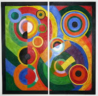
Rhythm: A repetition of objects occur- a pattern. It can also appear to have movement in the piece.
http://uploads3.wikipaintings.org/images/robert-delaunay/rhythm-1.jpg


Scale: Size of the object- large or small, or its space/lack of around it. Can also relate to its size and proportion to other objects.
http://i-cdn.apartmenttherapy.com/uimages/ny/9-9-alessi-mini-1.jpg


Dynamic: Something being loud or vibrant. Objects leading of the page. A layout consisting of energy.
http://i.istockimg.com/file_thumbview_approve/14348162/2/stock-illustration-14348162-dynamic-design-background-with-coloured-cubes.jpg


Bibliography:
http://www.thefreedictionary.com/middle+distance
http://www.mathsisfun.com/definitions/converging-lines.html
http://www.projectarticulate.org/glossary.php
http://www.artincanada.com/arttalk/arttermsanddefinitions.html#s